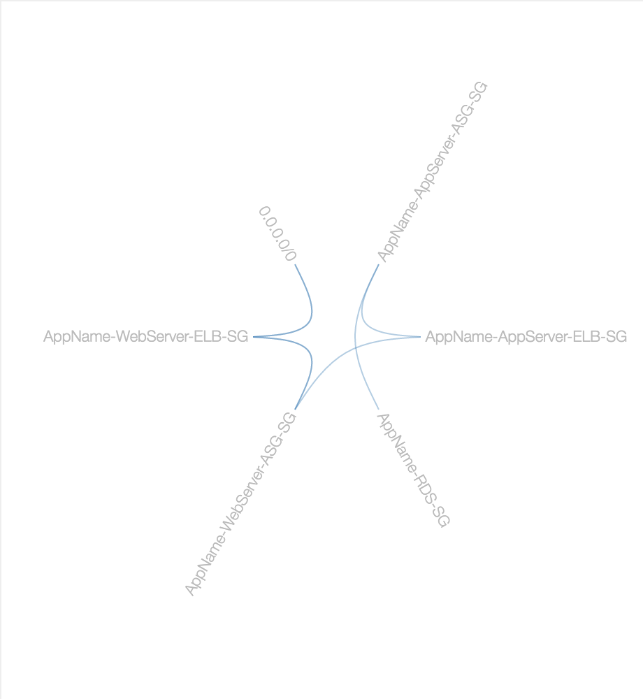
Here's my first attempt at visualising AWS EC2 Security Groups in something other than a boring table:
You can mouse over a SG name to see it's inbound (green) and outbound (red) connections to other groups/IP ranges.
What is this? Why is this? Read below for my motivation and process creating this interactive visualisation...
The Console
As someone who spends most of their time working on AWS, I spend a lot of time looking at this:
Now compared to a lot of other default dashboards out there, the AWS Console is fantastic. You can do almost everything though it, but the reality is that anything that has to cover so much functionality in it is bound to be, well, less than fantastic at a lot of things. Today's project is about supplementing the console's functionality in one of those areas it's not so good at...
The Firewall
As anyone who's worked in Enterprise IT knows, eventually you're going to run up against "the firewall". Firewalls are a great invention which keep the bad guys out.

Unfortunately they can also make it hard for the good guys to do their job.
Due to their security focus, they'll often silently drop things they don't like the look of without giving any indication as to why. While this is great from a security point of view (you wouldn't want to give the bad guys too much information about your network), from a troubleshooting angle it's not very helpful... In many cases you're not even sure it's the firewall that's causing the issue.
In AWS (specifically EC2) firewalls are called Security Groups.
Security Groups
Security Groups (SGs) are the name given to the AWS EC2 implementation of stateful firewalls. I'm not sure why they didn't just call them "EC2 Firewalls" - it sure would've saved me a lot of time and effort explain them to clients.
Whatever the reason, you can just think of them as firewalls and move on with your life.
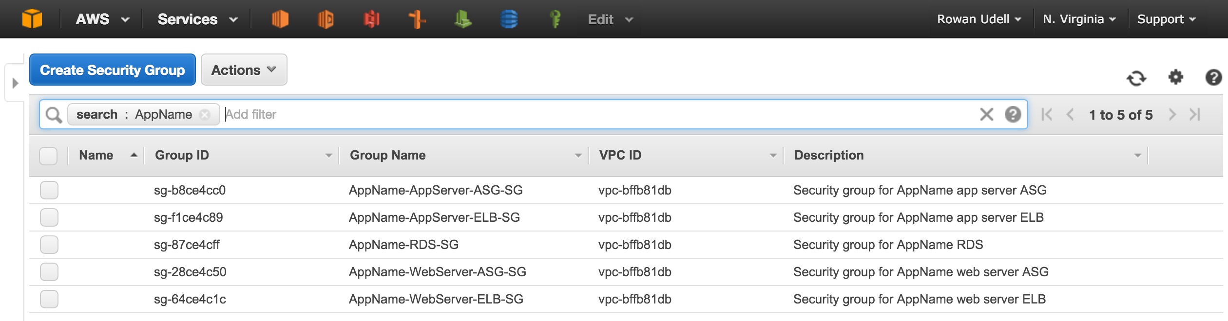
The AWS Console displays all of its information in a table like format. This is great for getting a high-level overview of your AWS resources, but doesn't take in to account the underlying purpose or functionality of those resources.
The security groups section of the EC2 Console shows the following information by default:
- Name
- Group ID
- Group Name
- VPC ID
- Description
As you might realise, none of these details tell you what the SGs are actually going to do.
Hopefully your names and descriptions are meaningful and up-to-date, but those are still no guarantee of what the SG will allow or drop silently.
To discover what a SG will do, you need to select it, and click on the "Inbound" or "Outbound" tab to see the specific rules. This also means you can't see both sets of rules at once - you must view one tab or the other. These inbound/outbound rules are the most interesting thing about SGs, and they're tucked-away behind multiple clicks/pages...
Given any real-world application is going to be made up of multiple SGs (at different layers of the application), the default console view gives you no way to see those relationships holistically (i.e. connections between SGs). If you get the configuration of your SGs wrong things will either no work at all, or they'll work and you'll be wide-open to attack from the Internet.
In order to improve this situation, I wanted to visualise the relationships between SGs. Having some experience with D3 I started looking at some of the possible visualisations.
Visualisation
While there are some existing sites/tools out there that have started to tackle the visualisation of AWS resources, they often focus more on a networking-level (VPC/Subnet) which is a different kind of relationship. I think most of these tools try to do too much in a single view, and become less effective/useful because of it.
Hierarchical Edge Bundling
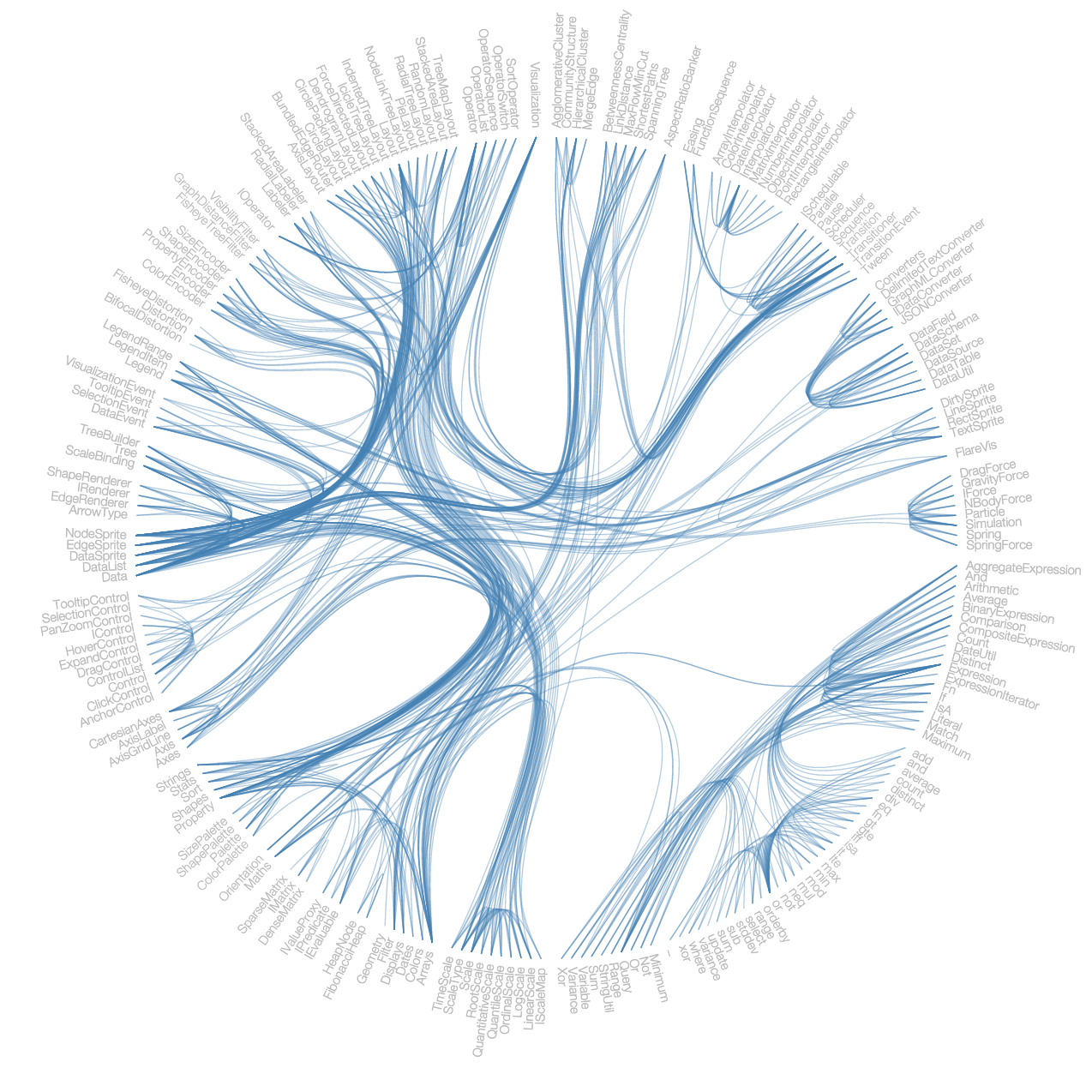
I ended up choosing a visualisation technique called hierarchical edge bundling because it combined a number of things I liked from the other techniques, as well as matching my own internal representation of SGs.
- It shows links (i.e. rules) between different objects (SGs)
- Each link is equally weighted
- Direction of link can be described by the colour
- It "wears" labels well
Implementation
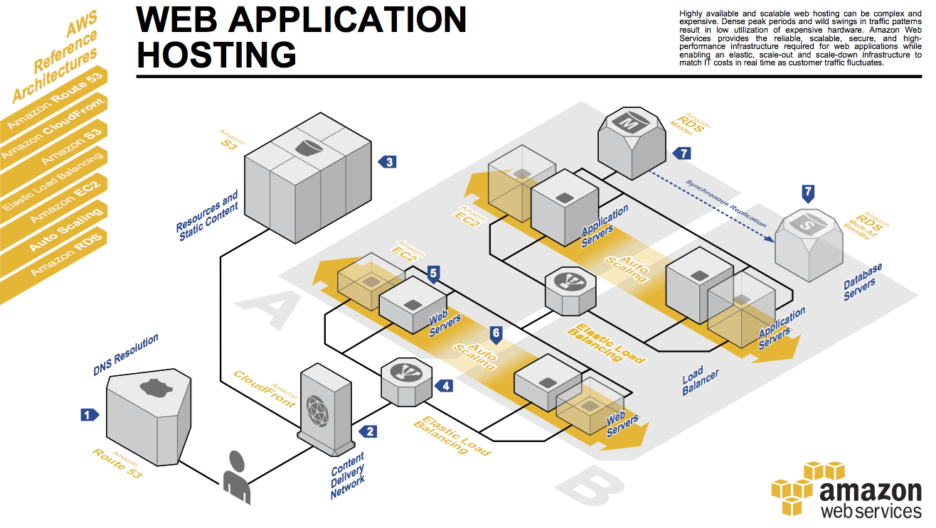
To test my visualisation, I created a basic three-tired web application based off the AWS Reference Architecture for web hosting:
Design
Based on that architecture (and ignoring all the components not relevant to Security Groups), we get the following SG design diagram:

Here's how that SG design looks after being implemented, from the AWS Console:
Not quite the same, right?
ETL
I usually approach these projects from the simple but effective method of Extract, Transform, Load - Even if it's not how my solution might end up, it's usually a safe place to start.
Extract
The first step was to process the live EC2 SG information in to a more D3-friendly format. To do this I used the SDK (in my case, JavaScript) to pull-down the security group information. You could easily do this with the AWS CLI using the --output json option.
Transform
This generally means converting it to an array-based format, so that all the interesting information is accessible in a consistent format (e.g. don't have the object's name as the key, have a property 'name' and get it from there, etc).
You can see the sample data in the gist.
Load
In the case of a visualisation, loading is probably more accurately referred to as rendering. Here's what it looks like again:
All the code and data is in this gist. The example looks quite clean, because it's based on the "best practice" architecture. In the real world, things aren't usually so simple.
Future plans
At the moment this process is on-demand, but it could be automated with a little more work. It would be good to include the exact port numbers being opened (maybe in an external table/legend), but for now I wanted to keep the interface as simple as possible.
I'd really like to try showing the same information with different visualisation techniques. If you find any other suitable approaches please let me know.
If it's the kind of thing you'd be interested in using yourself, let me know via email or in the comments below.